Research article

Household debt

Concentrated risk?

Household debt has been in the news recently with debate on whether we should be worried about current levels or not. Given the majority of household debt is secured against dwellings, it is an issue worth considering from a housing perspective.

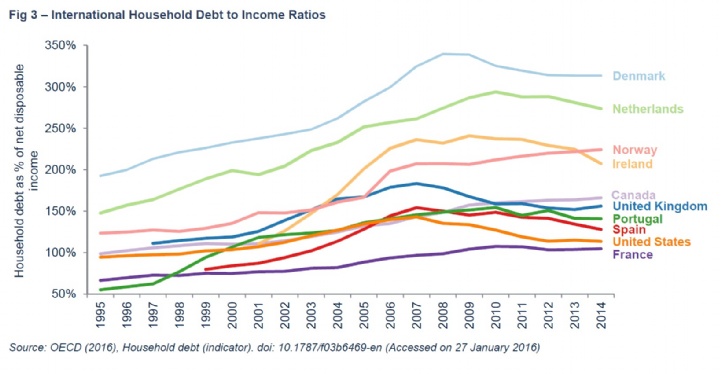
ONS data shows total household debt has fallen from its 2008 peak at 168% of gross disposable income to 142% in Q3 2015. That’s the same ratio as in 2003/04, the middle of the credit boom. A comparison with other countries also shows that the ratio of debt to (net) income remains high relative to many, although some countries appear to have more cause for concern. However, the cost of servicing household debt is within affordable levels thanks to record low rates and so this level of debt appears manageable in the current environment.

Household liabilities as percentage of gross disposable income
Household debt service ratios June 2015

Some of the concern around the level of debt has been driven by the OBR forecast for it to rise back towards peak levels. As per my previous note (http://sav.li/5eg), the debt to income ratio is an output of the OBR house price forecasting model. The forecast is driven by their measure for the income elasticity of demand; the historic trend whereby as incomes rise, the demand for housing rises faster.

However, this relationship was in a large part due to declining interest rates and increasing credit availability in the 20 years leading up to the credit crunch. The actual future for the debt to income ratio (and house prices) will depend not just on income growth and a historic relationship, but also other factors including financial regulation, credit availability, affordability, and possibly the level of new homes being built.

International household debt to income ratios

Perhaps of greater concern than the aggregate total, is the distribution of household debt. Although the overall debt to income ratio has fallen, the actual value of outstanding debt has risen by 7% in nominal values since 2008. That isn’t much, especially when compared to previous growth rates, but is at the same time that the total number of mortgage holders declined. As a result, the average outstanding mortgage value has risen by 15% since 2008 and the average value of a new mortgage for house purchase has increased by 22% over the same period.

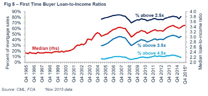
Household debt is becoming more concentrated, particularly amongst those who can raise the deposit to buy their first home. Despite mortgage regulation limiting higher loan-to-income mortgages (4.5x plus) to no more than 15% of a lender’s book, the median first time buyer loan-to income ratio has returned to its previous 2014 peak of 3.46x. Meanwhile, borrowers with higher mortgage-to-income ratios tend to spend more on servicing their debt, have their debt for longer, have higher levels of unsecured debt and may even be more exposed to higher interest rates.

Meanwhile, competition in the mortgage lending market looks set to grow but at the same time as increased buy-to-let regulation and continuing constrained first time buyer affordability. This could be a challenge for lenders looking for new customers and therefore could further increase the risk of mortgage debt becoming more concentrated amongst a smaller number of borrowers.

Outstanding mortgages and mortgaged homeowners UK

The difference between the number of outstanding owner-occupier mortgages and mortgaged homeowners will be due to second homes and investment properties with mortgages not categorised as buy-to-let.

First time buyer loan to income ratios

Although the proportion of new first time buyer (& overall) mortgages above the 4.5x limit has declined since its peak in Q2 2014, the data suggests there may have been an increase in lending up to the limit in the second half of 2015.

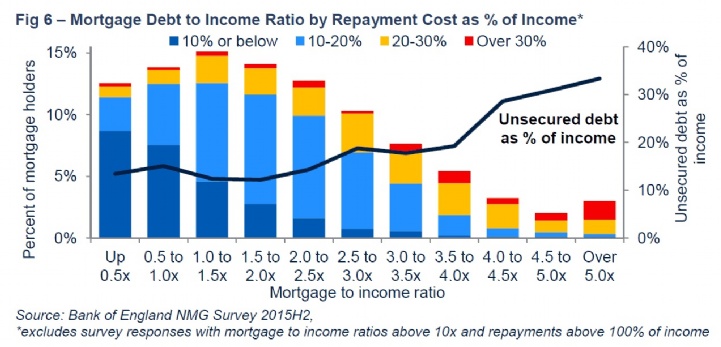
Mortgage debt to income ratio

Borrowers with higher mortgage (loan) to income ratios tend to spend a higher proportion of their income on repayments. However, we have seen an increase in the number of 30+ year mortgages which will help with the affordability. Their wider impact on the market and housing ladder remains uncertain.

The Bank of England’s NMG survey is an incredibly useful data source for households’ finances and I have been using it quite regularly in recent weeks. However, in the course of my analysis, I have found what appears to be an inconsistency in the raw survey data for the questions testing households’ ability to cope with higher interest rates. The question is next to the chart below.

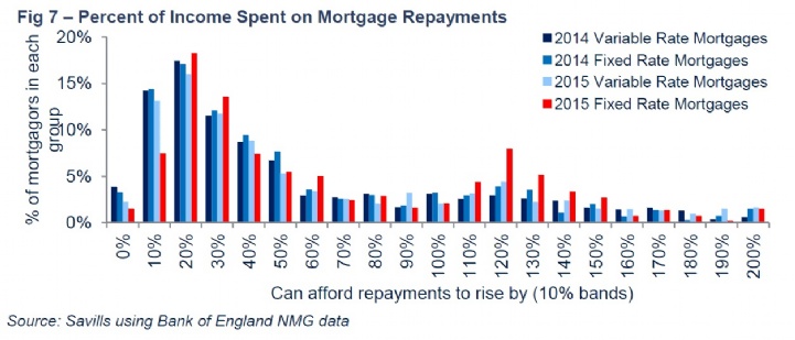
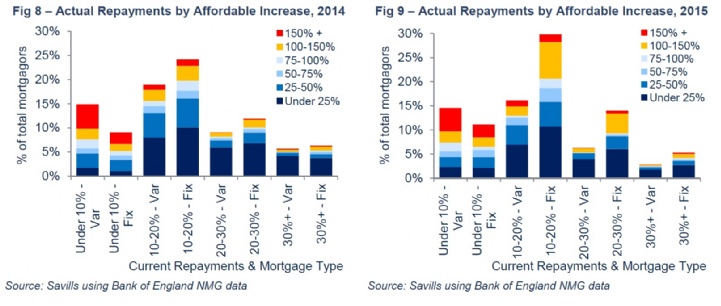
The results of the question expressed as a percentage of current mortgage repayments are shown in Fig 8 below for the 2014 and 2015 surveys. The majority of responses look sensible with a peak at households able to afford a 20% increase in repayments. However, there is a second peak at 120% that is most obvious in the 2015 data for households with fixed rate mortgages.

Percent of income spent on mortgage repayments

Given current low interest rates, there will inevitably be a number of households that can actually afford to increase their repayments by double or more. The charts below show the distribution of mortgage holders by their current repayments as a percentage of income and mortgage rate type, along with the percentage increase in repayments they could afford. As expected, the majority of households that could afford to more than double their existing repayments (yellow & red bars) are currently spending relatively low proportions of their income on repayments (less than 20%).

However, there are some respondents currently spending 20% or more of their income on repayments but think they could afford to repay double or more. Some of these responses will be correct but, again, this is particularly the case for respondents in 2015 with fixed rate mortgages. It looks like some people have replied to the question with the total repayment they could afford rather than just the increase. As a result, it is sensible to just look at the 2015 variable rate data.

The main use for this question is Chart 8 in the Bank of England’s Quarterly Bulletin*. They have very kindly rerun the chart using just variable rate data and note that: “While, there is less difference between 2014 and 2015 for small interest rate increases when looking at variable rate mortgagors only, the charts look very similar for increases in interest rates above 1 percentage point, and would not lead us to interpret them differently or draw different conclusions.”

In terms of concentrated debt, my analysis suggests there is less capacity for large repayment increases amongst households already spending 20% or more of their income. That suggests borrowers with larger mortgage-to-income ratios may struggle in the event of a significant mortgage rate rise. However, that prospect appears to be getting pushed further into the future.

Actual repayments by affordable increase

Other articles within this publication

23 other article(s) in this publication